
Work / Tea shop
Linden & Loose
A loose-leaf tea shop with forty teas in forty handwriting styles. Regulars knew their blend; newcomers were lost, the shelf looked like a jumble sale, and online there was only a price list in a document.
- SectorTea shop
- LocationRiga, Latvia
- Year2024
- DeliveredIdentity, packet system, online shop





What we did
- Drew a linden-leaf mark and a calm wordmark that sits on a packet without shouting.
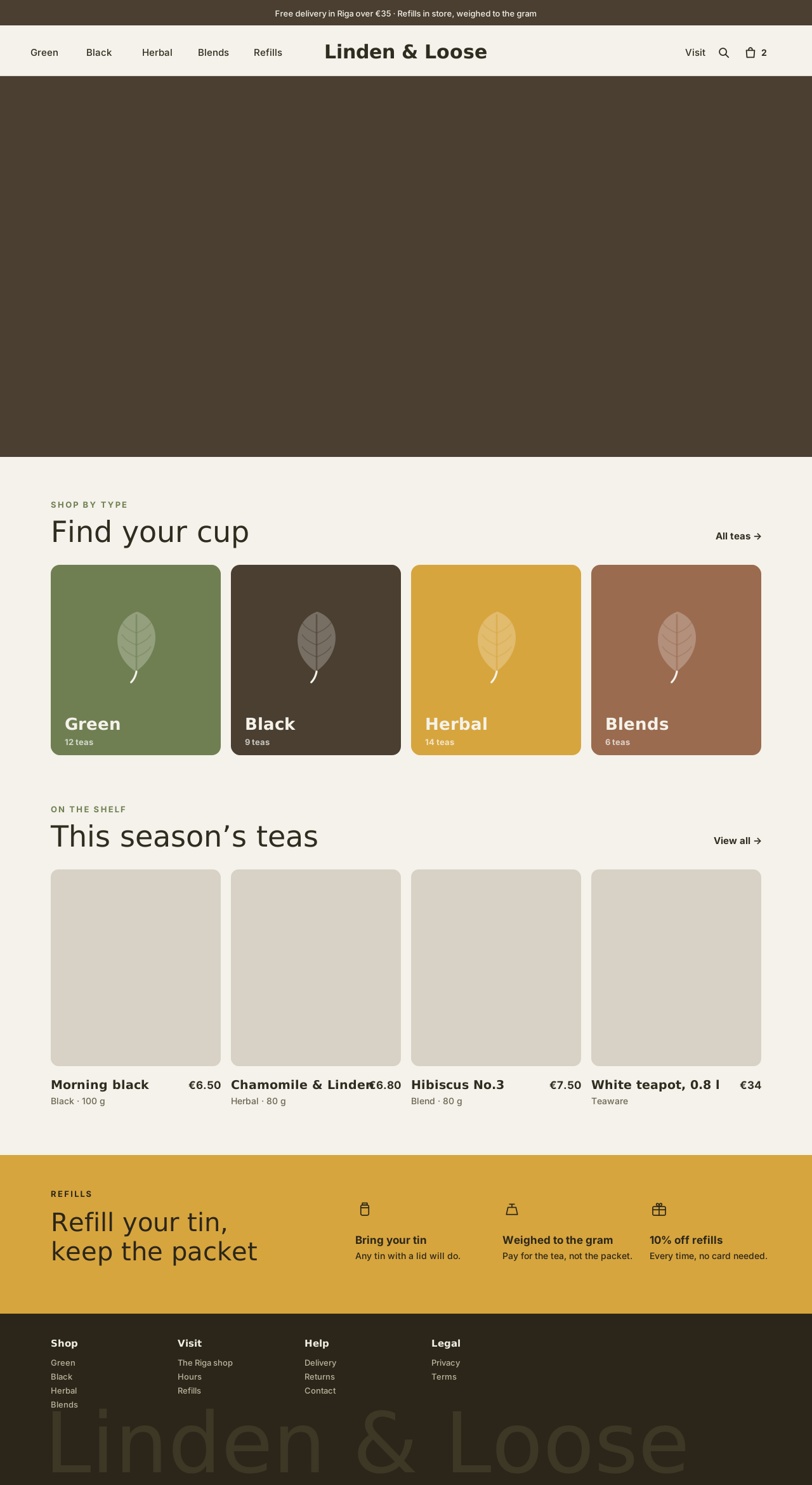
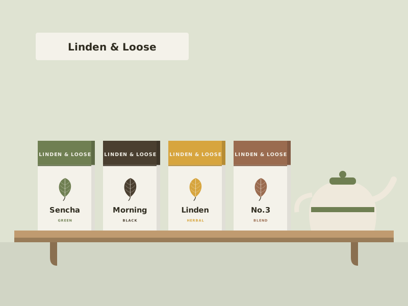
- Built a packet system where a colour and a single leaf icon group teas by type — green, black, herbal, blend.
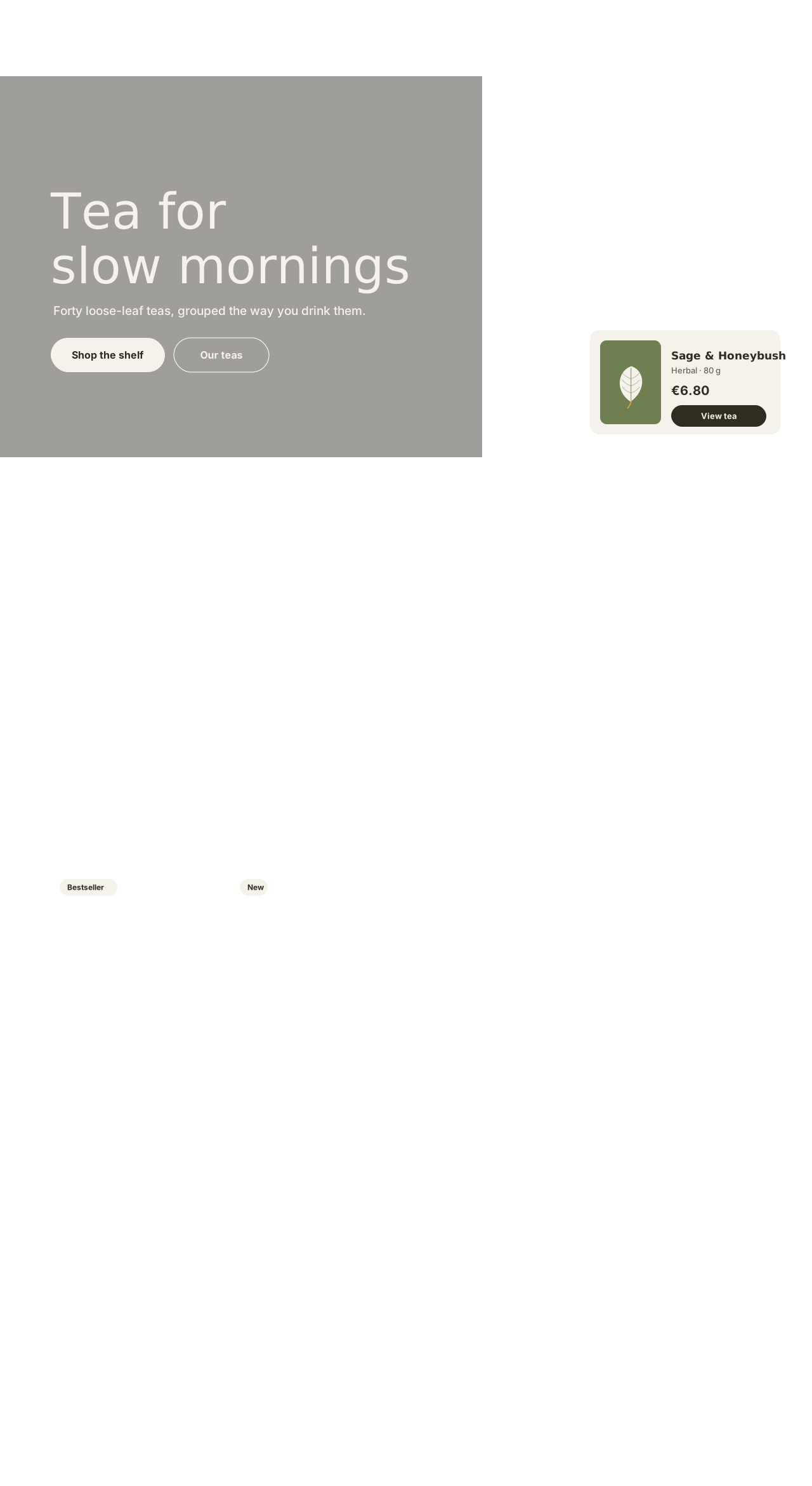
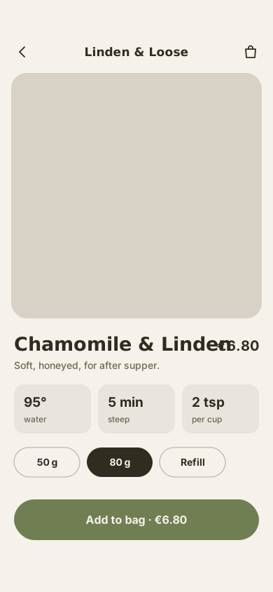
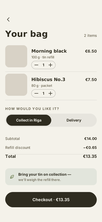
- Designed the online shop around the same colours: browse by type, a steeping guide on every tea, refills and collection in store.
- Kept checkout to two screens, with a refill discount for people who bring their own tin.
The outcome
Newcomers now shop the shelf — and the site — by colour and leave with the right tea. Online orders became a third of the shop’s sales in the first year, most of them collected in person.
Identity & packaging
“My shelf finally looks like a shop, not my handwriting forty times over.”— Owner, Linden & Loose
Next project
Backpedal →Mockup photography: Unsplash